
 There is something rotten in the State of Florida. And it is not just the incompetence of Governor Ron DeSantis’ (aka Mini-ME to Donald Trump’s Dr. Evil) response to the coronavirus pandemic. When it comes to reporting the number of deaths resulting from COVID19, the Florida Department of Health wants you to believe the DeSantis administration is making great progress. This has been a two-stage assault on the intelligence of all Floridians. In May, the Department fired data expert Rebekah Jones, who designed the “dashboard” which daily updated the number of cases, hospitalizations and deaths. She was removed after criticizing the administration for changing the criteria by which new cases were reported. For example, FDOH now excludes individuals who have received positive antibody test results as though they never contracted the virus.
Keep in mind, these numbers were supposed to be the basis on which the state could relax mitigation mandates (e.g. beach closings) and restrictions on group gatherings. Unfortunately, despite warnings to the contrary, DeSantis moved forward with his “open for business” agenda and Florida became the epicenter (or should that be the EPCOTcenter) of the COVID19 outbreak in the United States. Which brings me to stage two. If a picture is worth a thousand words, a graph can mask a thousand lies. Below is a graph from the official FDOH website, dated August 21, 2020, which shows number of new COVID19-related deaths each day.
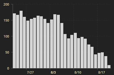
WOW! How could you argue the state is not making GREAT progress toward reducing the number of new deaths. On the website, if you place your cursor on each bar, you see the numbers on which the illustration is based. That tiny bar on the far right for August 20 (there is a one day time lag in reporting the data) represents just nine new deaths.
There is just one problem. The dashboard also reports that as of August 20, there were 10,168 total resident deaths due to COVID19. The dashboard, one day earlier, showed cumulative resident deaths at 10, 067, a one-day differential of 101. HUH? How could the cumulative total jump by 101 if there were only nine new deaths. Because those other 92 bodies were buried (non-pc pun intended) in the previous days’ numbers. And here’s the proof.
Below is a table which compares the number of deaths from August 12 through August 20 provided by FDOH on August 20 and August 21. The column headed “20-Aug” is the number of new deaths based on the version of the above chart published on August 20. The column headed “21-Aug” is the number for the same dates published on August 21. The next column is the difference between the two days. The column labeled “Cumulative Deaths” is the total number of resident deaths as of that day. The last column is the difference between the total deaths on that day and the previous day.
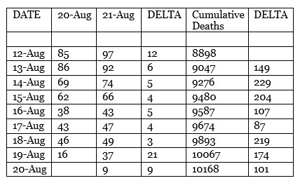
And there lies the deception. There is such a lag in FDOH’s official certification of a COVID19-related death and its inclusion in the data presented on the dashboard, it will always look like there is a significant decline. For example, 12 additional deaths on August 12 were not included in FDOH’s database until eight days later. Previous days’ numbers keep growing over time while current data is under-reported, only to be continuously updated later. The simple explanation? If you want to show a continuous decline in fatality over time, adjust the data by date of death rather than the day it was reported or daily increase in cumulative deaths.
A graph using the date an officially certified death was reported would look entirely different. Using the data for the eight days in the above table, there would be peaks and valleys over the eight day period, ranging from a low of 87 to a high of 229. But the eight-day average would be 158.75. A far cry from the visual the FDOH wants you to see.
BREAKING NEWS (11:00 AM, Saturday, August 22)
FDOH just updated the dashboard for August 22. Below is the revised graph.
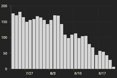
Remember that tiny August 20 bar with nine deaths. In just 24 hours it is now 29. The number of new deaths for August 21 is six. But, as has been the case on every previous day, the increase in cumulative death total does not come close to matching the number represented on the graph, 106 versus six.
Do not take my word for it. Here is the very, very small print on the FDOH website.
The Deaths by Day chart shows the total number of Florida residents with confirmed COVID-19 that died on each calendar day (12:00 AM – 11:59 PM). Death data often has significant delays in reporting, so data within the past two weeks will be updated frequently.
I suggest they add the following: But that is not going to stop us from presenting it in a way that clearly misrepresents the lack of progress the DeSantis administration is making toward getting this health crisis under control.
Quod erat demonstrandum.
Dr. ESP
Thanks! I had struggled – briefly – with these graphs and number (not my strong suit), which did not add up (literally!) then shrugged and just started checking the community dashboard created and managed by Rebekah Jones, the scientists fired earlier for not going along with the lies. BTW she can use our financial help keeping her website afloat.
I see Rebekah is now starting a national database to track coronavirus cases in schools.
Good investigation. Unfortunately, most residents will not take the time to delve into the specifics of these reports. (In defense, it is difficult not to get cross-eyed looking at these graphs.
In my view, as someone with a statistics background, graphs showing the running averages for new cases and deaths (usually 7-day) should be the “norm”. Alas, as you have pointed out, our Trump-annointed governor chooses the best “optics” to advance his agenda over the best way to present the ever-fluid nature of the status of the spread of Covid-19.
For anyone looking for a more neutral source, I suggest http://www.worldometer.com. A view showing the running averages can be chosen. (To access state-specific data, start with the links to the U.S. Statistics. Upon scrolling through the data aggregated by state, “click” on the state of interest to redirect to its relevant stats.